

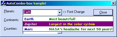
Here is one more article on ComboBox. This article presents yet another customized combo-box with the following features:
- AutoCompletion as you type on; it is similar to the WizardBar in VC++ Developer Studio.
- Each item can have one more column to supply extra information to the end user. The text (or say comment) is not part of the combobox, and does not participate in the AutoCompletion process. Neither it is shown when the combo-box is not dropped down.
- It uses owner-drawing. Backed with this, it also supports to change various colors (text, background, and so forth) and the font itself.
Despite all these facts, I made it as lightweight as possible.
The CAutoCombo Class
The class CAutoCombo is inherited, as is obvious, from the MFC CComboBox class. The necessary requirements for using this class are as follows:
- You need to sub-class your control by passing its resource ID.
- The following properties must be set; otherwise, it will assert:
- Type must be “DropDown”
- OwnerDrawing: Fixed
- “Has Strings” enabled
- “Sort” should be disabled
- After you perform subclassing, you can add items to it and perform other customizations.
Here is a generalized class definition:
class CAutoCombo:public CComboBox {
public:
   void AddString(CString strItem);
   void AddString(CString strText, CString strExtra);
   CAutoCombo();
   CString GetString(int nSel=-1);    // -1 means current selection

   int GetCurSel()const;
   void SetCurSel(int nSelect);
   void DeleteString(int nItem)       // Zero-based position
   void ResetContent();
   int SubclassDlgItem(UINT nID, CWnd* pParent,bool bTabbed=false,
                       int nTabPos=160);

   int GetCount() const;

   void SetColor(COLORREF nColor, AutoComboColor nFor=NormalText);
   void SetFontEx(CString strFace, bool bBold=true);
};
A Bit of Detail on Important Methods
The first thing, as was mentioned, is to subclass the control. To do this, you call the following:
mCombo.SubclassDlgItem(IDC_SAMPLE,this,    // mCombo is of type
                       true,100);          // CAutoCombo
where the first two parameters need no discussion. Third parameter specifies whether or not multi-column mode will be used. The fourth specifies (valid if third param is true), the distance in pixels where should comment (second column) begin. Right now, only left-aligned columns are supported. After doing this, you can add items by using:
mCombo.AddString("Sun","Our global energy!");
where first param is the actual combo-box’s string and the second string will be displayed on the right when the combo-box is dropped down. As soon as the user begins typing, it will be dropped down. The class also hides improper usage of CComboBox::AddString by overriding it. The second version can be used to supply comment-text by separating it throught the tab character (“\t”):
mCombo.AddString("Sun\tOur global energy!");
Only this single argumented version be used if multi-column is disabled (the third parameter of SubclassDlgItem is false); otherwise, it will ASSERT.
Changing Fonts
To change the font, you just need to call SetFontEx:
mCombo.SetFontEx("Palatino Linotype");
This sets the specified font. The second parameter of this method (which is, by default, false) expresses whether a bold font should be used. Right now, all items share the same font.
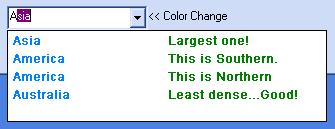
Changing Colors
To change colors, one needs to call a single method, SetColor:
   // Sets color for comments part, when item is selected
   // Sets normaltext color, does not affect selected mode color
mContinents.SetColor(RGB(0,0,128),SelectedComment);
mContinents.SetColor(RGB(0,128,255),NormalText);
Here, the first argument is manifest. The second argument tells “for which” color is to be changed. It can be from:
enum AutoComboColor {
   NormalText, NormalComment,
   SelectedText, SelectedComment,
   Selection
};
Currently, all items share the color property, depending on the selection mode.