

Introduction
Microsoft prides itself in having a strong aesthetic sense when it comes to the design of Windows 8. To ensure that applications built for Windows adhere to design theme, Microsoft has even published Design Principles for Windows applications (http://msdn.microsoft.com/en-us/library/windows/desktop/aa511328.aspx) .
One of the things that applications typically need is app bar command buttons. To ensure that application developers can easily make app bar command buttons, which match the design principles, Microsoft unveiled the AppBar controls as part of the new features being introduced in Windows 8.1.
The AppBar controls provide Windows Store application developers with controls, which can be used in Windows Store applications, that provide the ability to create app bar command buttons that adhere to Windows Design principles.
The AppBar controls reside in the Windows.UI.Xaml.Controls namespace for XAML based applications and WinJS.UI namespace for Javascript based applications.
There are three AppBar controls, which are of interest for Windows Store XAML application developers:
1. AppBarButton – A button control that differs from a standard button, in that it is round. The content for the AppBarButton is specified by setting the Label and Icon properties, unlike a standard button control (which uses the Content property).
2. AppBarToggleButton – This button control has two states between which they toggle.
3. AppBarSeparator – This control is used to add a separator between two groups of AppBar controls.
Each of the above controls has a property, “IsCompact,” to change the size to compact mode.
Windows Store Javascript developers can create a command that is represented as an AppBar using the WinJS.UI.AppBarCommand object.
Hands On
In this walkthrough, we will create a simple XAML based Windows Store application, which will demonstrate the use of AppBars.
Create a new Windows Store application titled Windows8.1AppBarDemo.
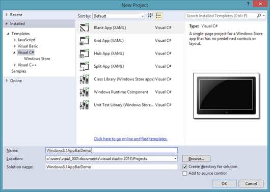
New Project
Open MainPage.xaml and add an AppBarButton control on the page. To add the AppBarButton control, you can search for the control in the ToolBox and drag and drop it on the Mainpage.xaml. Title the AppBarButton control “My AppBar Button”.
Next, we will add an AppBarSeparator next to the AppBarButton control.
Finally, we will add an AppBarToggleButton after the separator. We will title this control “My AppBar Toggle Button”.
The XAML code, which will be generated as a result of the above actions is below:
<AppBarButton x:Name="appBarButton" HorizontalAlignment="Left" Label="My AppBar Button" Margin="393,10,0,0" VerticalAlignment="Top"/>
        <AppBarSeparator HorizontalAlignment="Left" Margin="497,10,0,0" VerticalAlignment="Top"/>
        <AppBarToggleButton x:Name="appBarToggleButton" HorizontalAlignment="Left" Label="My AppBar Toggle Button" Margin="564,10,0,0" VerticalAlignment="Top"/>
If you run the application now, you will see that the AppBars will look like the image below:
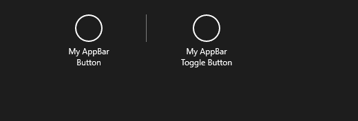
AppBars
Now, we will implement the click event handlers for the AppBar buttons.
private void appBarButton_Click(object sender, RoutedEventArgs e)
        {
            Windows.UI.Popups.MessageDialog md = new Windows.UI.Popups.MessageDialog("AppBarButton clicked");
            md.ShowAsync();
        }

private async void appBarToggleButton_Click(object sender, RoutedEventArgs e)
        {
            string checkedstatus = appBarToggleButton.IsChecked.ToString();
            Windows.UI.Popups.MessageDialog md = new Windows.UI.Popups.MessageDialog("AppBarButton clicked. Checked status = " + checkedstatus);
            await md.ShowAsync();
        }
Now, when we run the application and click on the “My Appbar Button”, you will notice the following.
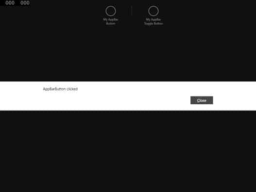
My Appbar Button
When we click on the toggle button, we will see the screenshot below when the toggle button is checked.
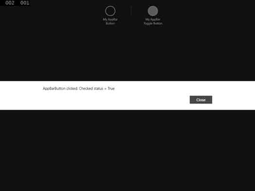
The Toggle Button is Checked
When the toggle button is unchecked, we will see:
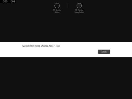
Toggle Button is Unchecked
Summary
In this article, we learned how Windows developers can use AppBar controls to provide a Windows design compliant app bar experience. I hope you have found this article useful.
About the author
Vipul Patel is a Program Manager currently working at Amazon Corporation. He has formerly worked at Microsoft in the Lync team and in the .NET team (in the Base Class libraries and the Debugging and Profiling team). He can be reached at vipul.patel@hotmail.com
http://code.msdn.microsoft.com/XAML-AppBar-control-sample-2aa1cbb4
http://msdn.microsoft.com/en-us/library/windows/apps/bg182878.aspx#AppBarControls