

Because I’m a Visual Basic 6 veteran, I’ve always wanted to be able to write a proper Drawing Application. Without the use of the Windows API, Visual Basic 6’s graphics capabilities was a bit too limited for my taste. GDI+ came to my rescue. This article series will introduce you to most of the features of GDI+ and how easy GDI+ actually is in a hands-on manner.
Designing the Interface
First, start with the Main Window. It probably comes as no surprise that this will be an MDI application. The reason for this is that you can have more than one drawing open at any given time. To add this MDI form to your application, Select Project, Add Windows Form…. Name this Form frmMDICanvas. The next thing you need to do with frmMDICanvas is to set the IsMdiContainer property to True.
Add a MainMenu component to this From; name the menu CMMFile. Include the following Menu items:
- &File and leave the default name
- &New and name this item mnuFNew
Voilà! Your first form is designed!
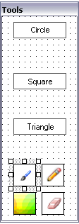
At a bare minimum, every graphics application has a ToolBox (to select tools and other various options, such as Colors and Drawing styles) and a Canvas on which to draw. With the included sample program, I have included the following options in the ToolBox:
- Shapes
- Circle
- Square
- Triangle
- Drawing Options
- Outlined
- Filled
- Color Selector
- Eraser
- Pencil Tool
In Design mode, the Toolbox looks like the following picture:
The Canvas in the included sample consists of an empty PictureBox, to be drawn on, and a Button to clear the drawing. In Design mode, the Canvas looks like the following picture:
As you can see, the design of this application is very basic at this stage.
Get Building!
- Start Visual Studio .NET.
- When prompted for a new Project name, enter Canvas for the Project’s name.
- When the first Form appears, open its Properties Window, and set the following properties:
- Name: frmCanvas
- Text: Computer Canvas
- WindowState: Maximized
- Add a PictureBox control to frmCanvas by double-clicking on it in the Toolbox. Set the following properties for the PictureBox:
- Name: picCDraw
- BackColor: White
- Cursor: Cross
- Dock: Fill
- Add a Button to the PictureBox in the same way you did the PictureBox. Set the following properties for the Button control:
- Name: butCClear
- Anchor: Bottom, Left
- BackColor: White
- FlatStyle: Flat
- Image: Set the Button’s Image Property to any picture that would describe the button’s use. If you choose not to include a picture for the button, set the Button’s Text Property to Clear.
- Size: 75, 32. Width: 75 Height: 32
- Add a ToolTip control to the Designer, and set the following property for the ToolTip:
- Name: tipCanvas
That’s it! Your canvas has been designed. It doesn’t look like much at this stage, but you will see further improvements to your canvas during the course of this article series. What you need now is a Toolbox for your drawing program.
Creating the Toolbox
To create your Toolbox, follow these steps:
- From the Project menu, select Add Windows Form… to add a new form to your project. When the Add New Item dialog box appears, type the following name for the new form: frmTools.vb.
- When the new form appears in the Designer Window, set the following properties for frmTools:
- Name: frmTools
- BackColor: White
- ControlBox: False
- FormBorderStyle: FixedToolWindow
- ShowInTaskBar: False
- Size: 112, 312 Width: 112 Height: 312
- StartPosition: Manual
- Text: Tools
- TopMost: True
- Add a Button to your frmTools, and set the following properties:
- Name: butCCircle
- BackColor: White
- FlatStyle: Popup
- Font:Arial, Arial, 8.25pt
- ForeColor: Black
- Location: 16, 8 X: 16, Y: 8
- Size: 75, 23 Width: 75, Height: 23
- Text: Circle
- Add a Button to your frmTools, and set the following properties:
- Name: butCSquare
- BackColor: White
- FlatStyle: Popup
- Font:Arial, Arial, 8.25pt
- ForeColor: Black
- Location: 16, 8 X: 16, Y: 8
- Size: 75, 23 Width: 75 Height: 23
- Text: Square
- Add a Button to your frmTools, and set the following properties:
- Name: butCTriangle
- BackColor: White
- FlatStyle: Popup
- Font:Arial, Arial, 8.25pt
- ForeColor: Black
- Location: 16, 8 X: 16, Y: 8
- Size: 75, 23 Width: 75 Height: 23
- Text: Triangle
- Add a Button to your frmTools, and set the following properties:
- Name: butCFillColor
- BackColor: White
- FlatStyle: Popup
- Font:Arial, Arial, 8.25pt
- ForeColor: Black
- Image: Set the Button’s Image Property to any picture, that would describe the button’s use. If you choose not to include a picture for the button, set the Button’s Text Property to Fill.
- Location: 16, 208 X: 16 Y: 208
- Size: 32, 32 Width: 32 Height: 32
- Add a Button to your frmTools, and set the following properties:
- Name: butCPencil
- BackColor: White
- FlatStyle: Popup
- Font:Arial, Arial, 8.25pt
- ForeColor: Black
- Image: Set the Button’s Image Property to any picture that would describe the button’s use. If you choose not to include a picture for the button, set the Button’s Text Property to Pencil.
- Location: 56, 208 X: 56, Y: 208
- Size: 32, 32 Width: 32 Height: 32
- Add a Button to your frmTools, and set the following properties:
- Name: butCColor
- BackColor: White
- FlatStyle: Popup
- Font:Arial, Arial, 8.25pt
- ForeColor: Black
- Image: Set the Button’s Image Property to any picture that would describe the button’s use. If you choose not to include a picture for the button, set the Button’s Text Property to Color.
- Location: 16, 248 X: 16 Y: 248
- Size: 32, 32 Width: 32 Height: 32
- Add a Button to your frmTools, and set the following properties:
- Name: butCEraser
- BackColor: White
- FlatStyle: Popup
- Font:Arial, Arial, 8.25pt
- ForeColor: Black
- Image: Set the Button’s Image Property to any picture that would describe the button’s use. If you choose not to include a picture for the button, set the Button’s Text Property to Eraser.
- Location: 56, 248 X: 56 Y: 248
- Size: 32, 32 Width: 32 Height: 32
- Add a ToolTip control to the Designer, and set the following property for the ToolTip:
- Name: tipCanvas
Note: You may need to adjust the Width property if you choose to include Text instead of an Image.
Note: You may need to adjust the Width property if you choose to include Text instead of an Image.
Note: You may need to adjust the Width property if you choose to include Text instead of an Image.
Note: You may need to adjust the Width property if you choose to include Text instead of an Image.
Now that you have finished the design of your first drawing application in .NET, you can start coding. Before you do that, however, let me explain what the whole goal of the above forms and their controls are.
Functions of the Various Controls
frmTools
| Object | Description |
|---|---|
| frmTools | Provides a holding place for all drawing tools |
| butCCircle | Draws a circle |
| butCSquare | Draws a square |
| butCTriangle | Draws a triangle |
| butCFillColor | Draws a filled shape |
| butCPencil | Draws freehand |
| butCColor | Opens the color selector |
| butCEraser | Erases drawings |
| tipCanvas | Provides tooltips for the various tools |
frmCanvas
| Object | Description |
|---|---|
| frmCanvas | Provides the drawing canvas |
| picCDraw | PictureBox to draw onto |
| butCClear | Clears the entire drawing |
| tipCanvas | Provides tooltips |
Now, get coding!