

Introduction
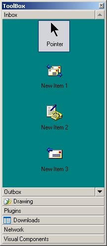
Follow along to learn about a ToolBox control that has the look and feel of VS.NET IDE’s ToolBox. About two weeks back, I was searching for a toolbox-like control for an UI design application. I came across Iulian Serban’s VS.Net-like ToolBox and its upgrade by Giorgio Santini. I used that control initally, but later on I had problems with it because it lacked the feature of renaming items (a requirement in our project) and also a little problem with drawing items when there were too many tabs and the item area was small. Its design is pretty good except that it uses button controls and panels to draw tabs and tab items. For these reasons, I thought of writing a ToolBox control myself.
This ToolBox control is a completely ownerdrawn control that includes animated tab movements, swapping/renaming tab/tab items, and, of course, drag drop support.
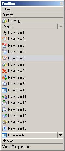
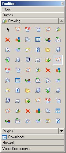
About the ToolBox Control
Classes:
    +-------------+
    | ToolObject  |
    +------o------+
           |\________
           |         \
    +------o------+    \
    | ToolBoxItem |      \
    +------o------+        \
           |                 \
           |            +----------------+
    +------o------+     |ToolScrollButton|
    | ToolBoxTab  |     +----------------+
    +-------------+

    +-------------+
    | UserControl |     // System.Windows.Forms.UserControl
    +-------------+
           |
           |
    +------o------+
    |   ToolBox   |
    +-------------+
The ToolBox object keeps an array of ToolBoxTabs. When a ToolBoxTab is added to the ToolBox, it registers five events with the parent (ToolBox). They are (a) MouseDown, (b) MouseUp, (c) MouseMove, (d) MouseLeave, and (e) Paint. These events are un-registered when the tab is removed. When the tab is disabled, all events except paint are un-registered; when it is enabled, events except paint are registered again.
ToolBox keeps two ToolScrollButton objects to render up and down scroll buttons respectively. It also initalizes a hidden edit control and adds it to its control collection (the one and only one child control).
Each ToolBoxTab object keeps an array of ToolBoxItems that can be added/deleted through member methods. A ToolBoxTab keeps a rectangle called itemArea into which the toolbox items are rendered. When the tab becomes unselected, this area reduces to an empty rectangle and the newly selected tab’s itemRect is prepared and rendered.
Items are scrolled when a click occurs in a scroll button or at a mouse wheel event.
If you want to set the imagelist from a bitmap strip (just like in MFC CToolBar), use the SetImageList(Image image, Size size, Color transparentColor) method of ToolBox, which will slice the image by a specified size and make the imageList using the given transparent color.
Properties of Interest
| Property | Description |
|---|---|
| BackColor | The background color of the control |
| TabHeight | Height of each tab |
| ItemHeight | Height of each tab item |
| ItemSpacing | Spacing between items |
| ItemHoverColor | Color of item when mouse is over it |
| ItemNormalColor | Normal color of item |
| ItemSelectedColor | Selected item color |
| SmallImageList | The imagelist whose image indices are used to render images in list view and small icon view |
| LargeImageList | The imagelist whose image indices are used to render images in large icon view |
| SmallItemSize | Size of the tool box item in small icon view |
| LargeItemSize | Size of the tool box item in large icon view |
Using the Code
Creating the ToolBox
// In your panel or form, add the following code.

using Silver.UI;     // At the top, you know ;)

ToolBox _toolBox     = new ToolBox();

_toolBox.BackColor   = System.Drawing.SystemColors.Control;
_toolBox.Dock        = System.Windows.Forms.DockStyle.Fill;
_toolBox.TabHeight   = 18;
_toolBox.ItemHeight  = 20;
_toolBox.ItemSpacing = 1;

_toolBox.ItemHoverColor    = System.Drawing.Color.BurlyWood;
_toolBox.ItemNormalColor   = System.Drawing.SystemColors.Control;
_toolBox.ItemSelectedColor = System.Drawing.Color.Linen;

_toolBox.Name     = "_toolBox";
_toolBox.Size     = new System.Drawing.Size(208, 405);
_toolBox.Location = new System.Drawing.Point(0, 0);

Controls.Add(_toolBox);
Adding a tab
// Create the tab (the second parameter is the image index).
ToolBoxTab tab = new ToolBoxTab("Tab Name",1);

// Add the tab
_toolBox.AddTab(tab);

// Or add it this way
_toolBox.AddTab("Another Tab ",-1);
Adding a Tab item
int tabIndex = 2;

_toolBox[tabIndex].AddItem("Item Caption", 10, true,
                           new Rectangle(10,10,100,100));

//Or this way

ToolBoxItem item = new ToolBoxItem();
item.Caption     = "New Item";
item.Enabled     = true;
item.ImageIndex  = 12;
item.Object      = new Rectangle(10,10,100,100);

_toolBox[tabIndex].AddItem(item);
Accessing tabs
ToolBoxTab tab;

//Selected Tab
tab = _toolBox.SelectedTab;

//Any tab
tab = _toolBox[tabIndex];
Accessing TabItems
TooBoxItem item;

//Selected item.
item = _toolBox.SelectedTab.SelectedItem;

//Any Item
item = _toolBox[tabIndex][itemIndex];
Events
//Notification when a renaming of a tabitem is finished
_toolBox.RenameFinished += new
   RenameFinishedHandler(ToolBox_RenameFinished);

private void ToolBox_RenameFinished(ToolBoxItem sender,
                                    RenameFinishedEventArgs e)
{
   // Set e.Cancel to true if rename was not acceptable.
   e.Cancel = true;
}

// Tab Selection change notification
_toolBox.TabSelectionChanged += new
   TabSelectionChangedHandler(ToolBox_TabSelectionChanged);

private void ToolBox_TabSelectionChanged(ToolBoxTab sender,
                                         EventArgs e)
{
   //Add your code
}

// TabItem Selection change notification
_toolBox.ItemSelectionChanged += new
   ItemSelectionChangedHandler(ToolBox_ItemSelectionChanged);

private void ToolBox_ItemSelectionChanged(ToolBoxItem sender,
                                          ToolBoxTab parent,
                                          EventArgs e)
{
   //Add your code
}

//Mapping other events (Item/Tab mouseup event can be used to
//show a context menu at the point of click).
_toolBox.TabMouseDown  += new
    TabMouseEventHandler(ToolBox_TabMouseDown);
_toolBox.TabMouseUp    += new
    TabMouseEventHandler(ToolBox_TabMouseUp);
_toolBox.ItemMouseDown += new
    ItemMouseEventHandler(ToolBox_ItemMouseDown);
_toolBox.ItemMouseUp   += new
    ItemMouseEventHandler(ToolBox_ItemMouseUp);
Note: Some of the events in ToolBox don’t adhere to the .NET event handling system. For example, see the RenameFinished event handler’s parameters. I thought there wasn’t a need for writing a RenameFinishedEventArgs class.
Points of Interest
Scrolling Items
At first, the scrolling of items was done by repositioning the itemArea of a tab. But, I had to abandon that because I couldn’t set the Graphics’ object clipping region properly. Now, scrolling is done by setting the Y coord of an item and, if its Y doesn’t lie completely inside itemArea, it is not drawn.
Disabled Image
When writing this control, I was looking for how to draw a disabled image as seen in VS IDE toolbar. Those images were not drawn using a DrawState API, as it can be clearly seen. A little bit of research led me to the http://www.bobpowell.net/grayscale.htm site, in which the author specifies a greyscale color matrix. It does the monochrome conversion, but I needed some more grey effect in it. So, here is my greyscale color matrix.
ColorMatrix cmtx   = null;
float[][]   matrix = new float[][]
  {
      new float[] {0.3f ,0.3f ,0.3f ,1, 1},
      new float[] {0.1f ,0.1f ,0.1f ,1, 1},
      new float[] {0.1f ,0.1f ,0.1f ,1, 1},
      new float[] {0.3f ,0.3f ,0.3f ,1, 1},
      new float[] {0.08f,0.08f,0.08f,0, 1},
      new float[] {1    ,1    ,1    ,1, 1},
   };
cmtx      = new ColorMatrix(matrix);
Another really interesting thing is that I have not tested this control thoroughly. There might be bugs and bunnies. (Pssst! It is better to wrap the toolbox into a container like a panel rather that leaving it alone.)
Why the Namespace Silver.UI?
My name is Aju George. So, it’s AG or Ag. Chemically, Ag means Silver. So, it’s Me.UI.
Changes
| 11/06/2004 | – DragDelay for toolbox items by Neal Stublen. – Minor change in PaintItems control logic by Neal Stublen |
| 11/07/2004 | – Context menu with handlers for rename textbox – Positioning and font for textbox. – Item state change for both M-buttons on mousedown. – Timer/Scroll delay get/set methods. |
| 11/07/2004 | – A Bug and a Bunnie pointed out by NashControl got fixed – Updated Demo Application |
| 10/10/2005 |
– Split code to different files. – Changes in project settings (DLL) – Added XML Serialization methods. – Added specialized collections of tabs and items. – More events added (see Delegates.cs) – Two more view modes added for toolbox items. (Large Icon, Small Icon View) – Support for large and small image lists. – New properties to configure tab/items look ‘n’ feel. – Added support to associate a control for a tab. – More changes added in drawing. – Improved renaming of tabs and items. – Swapping of tabs, items by drag drop. – Various other bug fixes. – Updated Demo Application. |
Notes
- When XML serializing the toolbox, you can use OnSerializeObject and OnDeSerializeObject events to handle the saving/loading of the object associated with a tool box item. You can also save/load the control info of a tab in these events.
- Tab/Item Renaming configurable by SelectAllTextWhileRenaming and UseItemColorInRename properties.
- Swapping of Tab/TabItem can be turned on/off by AllowSwappingByDragDrop property.
- Custom sizes of tab items in large/small icon view can be specified using LargeItemSize, SmallItemSize property.
- A window control can be associated with a tab control by using its Control property. If a control is specified like this, the tool box items for that tab will be destroyed.
- ToolBoxTabs can be configured to have different look ‘n’ feel. See the ToolBoxTab.cs for a list of new properties.
- If you specify ItemBorderColor either in the toolbox or a toolbox tab, the items will not be drawn with a 3D raised style when the mouse hovers on it. The ItemBackgroundColor of ToolBoxTab or ToolBox can be used to give a custom background color for a specific tab or all tabs. ItemHoverTextColor and TabHoverTextColor can be used to give a custom text color when the mouse hovers on it.
- Toolbox tabs can be switched by pressing Ctrl+Tab or Ctrl+Shift+Tab. Tab items can be iterated by using arrow keys and tab keys.
- You can add custom data formats to the drag data object by mapping the OnBeginDragDrop event in ToolBox.
- The ShowOnlyOneItemPerRow property of ToolBox, ToolBoxTab makes only one ToolBoxItem to be listed per row in Large Icon and Small Icon view mode.