

Xamarin and C# provide a great way to develop iOS applications. But these days, there are so many screen sizes and resolutions across Apple devices that creating a UI that looks great on all of them can be a daunting task. Starting with Xamarin 3, a new tool was added: Xamarin Designer for iOS. It was the first time developers on a PC could create a full-blown native UI’s for iOS—inside Visual Studio, no less. And, the drag/drop ease-of-use was beyond even Apple’s Mac-based tools.
One of the best features provided by the Xamarin Designer is the ability to specify constraints on the layout of your controls. With constraints, you not only position and size your controls visually, but you also identify how the controls should be anchored to the screen or to other controls and which should be resized to take advantage of larger screens.
The constraint interface is not difficult, but it’s not immediately intuitive either. Worse, there are several gotchas the will derail you if you don’t figure out how to work with (or around) them. In this article, I’ll give you a jump-start to understanding all the essentials. Afterwards, you’ll be able to define the dynamic layout of your entire application.
Controlling the Position/Resize Mode
Clicking a control on your storyboard layout puts the control in resize mode—with round dots on all sides and corners of the control.
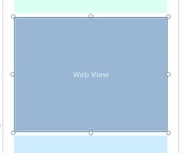
Figure 1: The storyboard in resize mode
You can drag these to resize the control or drag the control itself to adjust its placement. (Unfortunately, there are no X, Y coordinates to manually set the location under in the Properties panel.) You can set the location (and the height/width) from code, if you need to. However, the best approach is to maintain the position, working with sizing and layout in the designer as much as possible.
Anchoring the Control’s Position and Automatic Stretching
Clicking a control that is already in resize mode will put it in anchoring mode, showing capital T-shaped handles on all sides of the control and a capital I-shaped handle on the right and bottom.
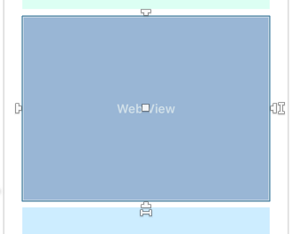
Figure 2: The storyboard in anchoring mode
Dragging/dropping the T-shaped handle to the left/right edges indicates that you want the fixed distance between the control and the screen to remain constant. A line will appear to represent the anchor.
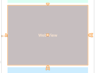
Figure 3: Maintaining a fixed distance
Note that, until you specify all your constraints, the control outline and handles will appear orange. When all your constraints are configured properly (specifying the location and size of the control), the outline will turn blue and the handles white. If you see red outline/handles, it indicates that you have conflicting constraints and something needs to be removed or re-done.
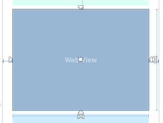
Figure 4: The outline and handles change color
If you drag both the left and right handles to the corresponding left/right sides of the screen, you are indicating that the relative distances on both sides should be maintained, resizing the control horizontally as necessary.
The same is true for the top and bottom with the following caveats:
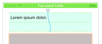
- When anchoring to the top of the screen, drop the handle on the big green bar labeled Top Layout Guide.

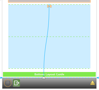
Figure 5: Anchoring to the top of the screen - However, when anchoring to the bottom of the screen, do not drop the handle on the Bottom Layout Guide. Instead, go below it to the dotted line that represents the actual bottom of the screen (immediately above the gray bar at the bottom of the View Controller). I don’t know why, but when I anchored to the Bottom Layout Guide, the controls were unpredictable in placement and stretching.

Figure 6: Anchoring to the bottom of the screen
If you want to remove an anchor, you can click on the line that represents it. This will select it (as you see below). Then, just hit the Delete key to remove it. This can be very tricky on short lines and lines that are very close to other elements. Sometimes, it’s easier to remove all constraints and then add the ones you want back in.
Figure 7: Removing an anchor
To remove all constraints on a control, select it and then click the red X in the upper right of the designer screen (after the word CONSTRAINTS).
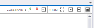
Figure 8: Removing all constraints on a control
Specifying a Fixed Size for the Control
You can see two I handles on the control when it’s in anchoring mode—one on the right and one on the bottom. These allow you to specify a fixed size for your control, assuring that it won’t stretch.
To specify a fixed width, carefully click the I handle at the bottom of the control. I say carefully because if you move the mouse, even a little bit, while the right button is down, it will perform a different action that you don’t want. If a new line with an = sign on it appears, hit Ctrl+z to undo and try again.
When you right-click, a small popup menu appears. Click Width.
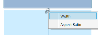
Figure 9: Calling a popup menu
This will cause a new line to appear across the bottom of the control. This indicates that the width should always remain a constant regardless of the size or shape of the screen. The same process can be performed with the I handle on the right to set a fixed height.
Be aware that if you have, for example, the right/left T handles anchored to the right/left sides of the screen and then you set a fixed width, you have conflicting constraints and the behavior will be unpredictable. The same is true for anchored top/bottom and a fixed height. Do one or the other, but not both.
Additional Tips
Avoid anchoring controls to other controls. Opt to anchor controls to the sides of the screen, whenever possible. This approach is more reliable. It also assures that resizing/changing constraints on one control doesn’t have ripple effects on other controls.
In the Properties panel for a selected control, you’ll usually work in the Widget tab to specify properties like the name, initial text, background color, and so forth. There is a Layout tab at the top that you can switch to; however, it’s best not to mess with these settings. These are a lot less visual and powerful than the layout approach discussed here.
Using Custom Controls in the Designer
Do you have a third-party iOS library of controls (like those from Telerik)? Or perhaps you’ve created your own custom controls. Because these controls don’t show up in the Toolbox, you may assume that there’s no way to use them in the Designer. Ah—but there is!
- Grab a UIView from the Toolbox. Then, drop and resize it on your View Controller.
- With the control selected, look for Class in the Properties pane.
- Change the class from UIView to the name of a custom control.
- Name the control and then set up your constraints as you normally would.
The control will still look like an empty box in your View Controller, but that’s all you need to set up your placement, sizing, and constraints. It’s a whole lot easier than writing code to do it!
Conclusion
In this article, I’ve given you the information you need to make your layout flexible and dynamic. But, these aren’t the extent of Xamarin’s capabilities here. If you want more control or perhaps you want to make a completely different layout for tablets, this and more are possible!