

The following is Chapter 3, “Important New Concepts in WPF,” from Windows Presentation Foundation Unleashed (WPF), by Adam Nathan, ISBN 0672328917, published by Sams Publishing. Reprinted with the publisher’s permission.
Chapter 3: Important New Concepts in WPF
To finish Part I of this book, and before getting to the really fun topics, it’s helpful to examine some of the main concepts that WPF introduces above and beyond what .NET programmers are already familiar with. The topics in this chapter are some of the main culprits responsible for WPF’s notoriously steep learning curve. By familiarizing yourself with these concepts now, you’ll be able to approach the rest of this book (or any other WPF documentation) with confidence.
Some of this chapter’s concepts are brand new (such as logical and visual trees), but others are just extensions of concepts that should be quite familiar (such as properties and events). As you learn about each one, you’ll also see how to apply it to a very simple piece of user interface that most programs need—an About dialog.
Logical and Visual Trees
XAML is natural for representing a user interface because of its hierarchical nature. In WPF, user interfaces are constructed from a tree of objects known as a logical tree.
Listing 3.1 defines the beginnings of a hypothetical About dialog, using a Window as the root of the logical tree. The Window has a StackPanel child element (described in Chapter 6, “Layout with Panels”) containing a few simple controls plus another StackPanel which contains Buttons.
LISTING 3.1 A Simple About Dialog in XAML
<Window
   Title="About WPF Unleashed" SizeToContent="WidthAndHeight"
   Background="OrangeRed">
   <StackPanel>
      <Label FontWeight="Bold" FontSize="20" Foreground="White">
         WPF Unleashed (Version 3.0)
      </Label>
      <Label>© 2006 SAMS Publishing</Label>
      <Label>Installed Chapters:</Label>
      <ListBox>
         <ListBoxItem>Chapter 1</ListBoxItem>
         <ListBoxItem>Chapter 2</ListBoxItem>
      </ListBox>
      <StackPanel Orientation="Horizontal"
                  HorizontalAlignment="Center">
         <Button MinWidth="75" Margin="10">Help</Button>
         <Button MinWidth="75" Margin="10">OK</Button>
      </StackPanel>
      <StatusBar>You have successfully registered this
                 product.</StatusBar>
   </StackPanel>
</Window>
Figure 3.1 shows the rendered dialog (which you can easily produce by pasting the content of Listing 3.1 into a tool such as XamlPad), and Figure 3.2 illustrates the logical tree for this dialog.
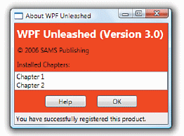
FIGURE 3.1 The rendered dialog from Listing 3.1.
Note that a logical tree exists even for WPF user interfaces that aren’t created in XAML. Listing 3.1 could be implemented entirely in procedural code and the logical tree would be identical.
The logical tree concept is straightforward, but why should you care about it? Because just about every aspect of WPF (properties, events, resources, and so on) has behavior tied to the logical tree. For example, property values are sometimes propagated down the tree to child elements automatically, and raised events can travel up or down the tree. Both of these behaviors are discussed later in this chapter.
A similar concept to the logical tree is the visual tree. A visual tree is basically an expansion of a logical tree, in which nodes are broken down into their core visual components. Rather than leaving each element as a “black box,” a visual tree exposes the visual implementation details. For example, although a ListBox is logically a single control, its default visual representation is composed of more primitive WPF elements: a Border, two ScrollBars, and more.
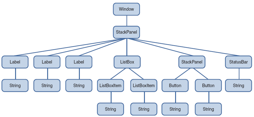
FIGURE 3.2 The logical tree for Listing 3.1.
Not all logical tree nodes appear in the visual tree; only the elements that derive from System.Windows.Media.Visual or System.Windows.Media.Visual3D are included. Other elements (and simple string content, as in Listing 3.1) are not included because they don’t have inherent rendering behavior of their own.
Figure 3.3 illustrates the default visual tree for Listing 3.1 when running on Windows Vista with the Aero theme. This diagram exposes some inner components of the UI that are currently invisible, such as the ListBox‘s two ScrollBars and each Label‘s Border. It also reveals that Button, Label, and ListBoxItem are all comprised of the same elements, except Button uses an obscure ButtonChrome element rather than a Border. (These controls have other visual differences as the result of different default property values. For example, Button has a default Margin of 10 on all sides whereas Label has a default Margin of 0.)
TIP XamlPad contains a button in its toolbar that reveals the visual tree (and property values) for any XAML that it renders. It doesn’t work when hosting a Window (as in Figure 3.1), but you can change the Window element to a Page (and remove the SizeToContent property) to take advantage of this functionality.
Because they enable you to peer inside the deep composition of WPF elements, visual trees can be surprisingly complex. Fortunately, although visual trees are an essential part of the WPF infrastructure, you often don’t need to worry about them unless you’re radically restyling controls (covered in Chapter 10, “Styles, Templates, Skins, and Themes”) or doing low-level drawing (covered in Chapter 11, “2D Graphics”). Writing code that depends on a specific visual tree for a Button, for example, breaks one of WPF’s core tenets—the separation of look and logic. When someone restyles a control like Button using the techniques described in Chapter 10, its entire visual tree is replaced with something that could be completely different.
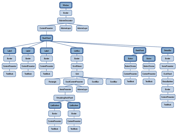
FIGURE 3.3 The visual tree for Listing 3.1, with logical tree nodes emphasized.
That said, you can easily traverse both the logical and visual trees using the somewhat symmetrical System.Windows.LogicalTreeHelper and System.Windows.Media. VisualTreeHelper classes. Listing 3.2 contains a code-behind file for Listing 3.1 that, when run under a debugger, outputs a simple depth-first representation of both the logical and visual trees for the About dialog. (This requires adding x:Class="AboutDialog" and the corresponding xmlns:x directive to Listing 3.1 in order to hook it up to this procedural code.)
WARNING Avoid writing code that depends on a specific visual tree! Whereas a logical tree is static without programmer intervention (such as dynamically adding/removing elements), a visual tree can change simply by a user switching to a different Windows theme!
LISTING 3.2 Walking and Printing the Logical and Visual Trees
using System;
using System.Diagnostics;
using System.Windows;
using System.Windows.Media;

public partial class AboutDialog : Window
{
   public AboutDialog()
   {
      InitializeComponent();
      PrintLogicalTree(0, this);
   }

   protected override void OnContentRendered(EventArgs e)
   {
      base.OnContentRendered(e);
      PrintVisualTree(0, this);
   }

   void PrintLogicalTree(int depth, object obj)
   {
      // Print the object with preceding spaces that represent its depth
      Debug.WriteLine(new string(bo?= bo?=, depth) + obj);

      // Sometimes leaf nodes aren't DependencyObjects (e.g. strings)
      if (!(obj is DependencyObject)) return;

      // Recursive call for each logical child
      foreach (object child in LogicalTreeHelper.GetChildren(
         obj as DependencyObject))
      PrintLogicalTree(depth + 1, child);
   }

   void PrintVisualTree(int depth, DependencyObject obj)
   {
      // Print the object with preceding spaces that represent its depth
      Debug.WriteLine(new string(bo?= bo?=, depth) + obj);

      // Recursive call for each visual child
      for (int i = 0; i < VisualTreeHelper.GetChildrenCount(obj); i++)
      PrintVisualTree(depth + 1, VisualTreeHelper.GetChild(obj, i));
   }
}
When calling these methods with a depth of 0 and the current Window instance, the result is a text-based tree with the exact same nodes shown in Figures 3.2 and 3.3. Although the logical tree can be traversed within the Window‘s constructor, the visual tree is empty until the Window undergoes layout at least once. That is why PrintVisualTree is called within OnContentRendered, which doesn’t get called until after layout occurs.
Navigating either tree can sometimes be done with instance methods on the elements themselves. For example, the Visual class contains three protected members (VisualParent, VisualChildrenCount, and GetVisualChild) for examining its visual parent and children. FrameworkElement, a common base class for controls such as Button and Label, defines a public Parent property representing the logical parent. Specific subclasses of FrameworkElement expose their logical children in different ways. For example, some classes expose a Children collection, and other classes (such as Button and Label) expose a Content property, enforcing that the element can only have one logical child.
TIP Visual trees like the one in represented in Figure 3.3 are often referred to simply as element trees, because they encompass both elements in the logical tree and elements specific to the visual tree. The term visual tree is then used to describe any subtree that contains visual-only (illogical?) elements. For example, most people would say that Window‘s default visual tree consists of a Border, AdornerDecorator, two AdornerLayers, a ContentPresenter, and nothing more. In Figure 3.3, the top-most StackPanel is generally not considered to be the visual child of the ContentPresenter, despite the fact that VisualTreeHelper presents it as one.