

As you are probably aware, pages in Windows Phone
7/WP7 are created using XAML (eXtensible
Application Markup Language). Unlike other mobile platforms, the highly
structured nature of XAML includes several different controls that provide
different layout methods. This is somewhat of a departure from other platforms
where controls are placed on screen/page using an absolute position only. Absolute
positioning does have its merits; however, as soon as you need to allow your
application to run on multiple screen sizes you will need to make changes to
your app to support the different screen size. Once you become familiar with
other schemes of layout you should find yourself needing absolute positioning
less and less. Listed below are the basic layout controls available for WP7.
Canvas
The first layout method that can be used is the Canvas, which provides the
ability to perform absolute layouts. Yes, WP7 does provide support for absolute
layouts; however, it really isn’t recommended for the reasons described above.
Nonetheless, it is available and provides you with the ability to perform X, Y
positioning of controls within the Canvas. The Canvas is good to get a general
idea of how you want your screen to look; then it is a good idea to go back and
recreate using the other layout controls listed below. The image below shows a
simple layout with two controls inside the canvas as well as the corresponding
XAML for the image.
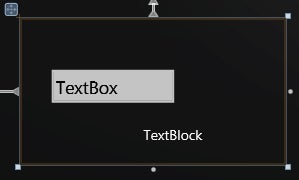
Figure 1: Canvas Layout
Stack Panel
The Stack Panel allows you to place controls either horizontal or vertical,
which is one of the more common layout methods you will find used. At first
this may not seem useful, but when you consider the fact that you can embed one
stack inside another, it is very useful. If you start with a vertical stack
panel and you populate it with multiple items you wind up with the makings of a
list as shown below with the accompanying XAML.
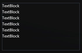
Figure 2: Vertical Stack Panel
Next, if you replace the TextBlock with a Horizontal StackPanel you are able
to create a rudimentary grid and/or more complex elements within your list. If
you specifically need to perform Grid style layout then you need to look at the
Grid layout below.
Grid
The Grid Layout basically allows you to group your controls into rows and
columns similar to HTML tables. The Grid Layout is used in many locations
including the basic templates available in Microsoft Visual Studio
for Windows Phone 7 as shown in the screenshot below and the accompanying XAML.
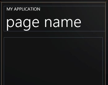
Figure 3: Grid Layout
Scroll View
Finally we have the Scroll View which is technically a layout, but works best
when accompanied with one of the others below. Basically, the Scroll View
provides you with the ability to support horizontal or vertical scrolling. For
instance if you were to combine the Stack Panel above with a Scroll View you
can further the list capabilities of the basic list with a Stack Panel. If you
were to dig into the XAML used for many applications you would find the lists
were built using the Vertical Stack Panel wrapped in a Vertical Scroll View.
Conclusion
With the above controls it should be easy to see how much power you have at
your disposal when it comes to building layouts for your Windows Phone 7
applications. The important thing to remember here is that these layout
controls can be embedded within one another, allowing you a lot of flexibility.
I hope you can see this flexibility nearly completely eliminates the need absolute
style layouts provided by the Canvas. Thus if you eliminate the need for the
Canvas today you should be able to provide better future capability for your
app on future hardware.