

This article and the sample project attached shows techniques to create a custom WPF window style. It was developed on the .Net 3.5 Framework with VS 2005.
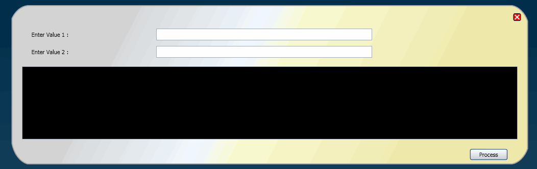
This demonstrates a simple window with a custom style having rounded borders and a few sample controls. The form does not have a header section in the UI element during display at runtime but can be moved around nonetheless by clicking the body and dragging the mouse to the desired position. A close button completes the basic form handling. The controls embedded in the XAML really do nothing other than provide a look and feel of a form meant to handle some tasks!
The image below shows a runtime view of the custom window. (Pardon my color selections if they assault the senses!)
The Window styles are created using the Path class. The Path class provides the ability to draw curves and complex shapes. These curves and shapes are concretely described using Geometry objects. In a Path, you create a Geometry and use it to set its PathGeometry member.
<!--Non-Rectangular window edge, created with PathGeometry-->
<Path Stroke="DarkGray" StrokeThickness="2" Height="346" Width="1032" Opacity="0.9">
PathGeometry in turn has the PathFigure member. Here you set the start point of the shape. Specifically, the geometrical layout \ design is accomplished the LineSegment and ArcSegment classes. These set the Path object’s PathFigure property.
<Path.Data>
    <PathGeometry>
        <PathFigure StartPoint="40,20" IsClosed="True">
            <LineSegment Point="990,20" ></LineSegment>
              <ArcSegment Point="1020,50" Size="40,55" SweepDirection="Clockwise">
              </ArcSegment>
        </PathFigure>
    </PathGeometry>
</Path.Data>
The Path.Fill member describes how the interior of the shape is painted. Here it is possible to specify the colors and the gradients of those colors. The color fill and gradients are specified using LinearGradientBrush and GradientStop members inside of the Path.Fill member.
<Path.Fill>
    <LinearGradientBrush StartPoint=".2,0" EndPoint="0.8,1">
        <GradientStop Color="Lightgray"  Offset="0">
        </GradientStop>
    </LinearGradientBrush>
</Path.Fill>
All this is achieved using the Canvas UI element as the base member of the WPF form. The Canvas panel is for creating complex drawings because it supports absolute positioning of all of its child objects. Canvas elements can also be used to specify transparency property using the Opacity, something that is also seen in this sample.